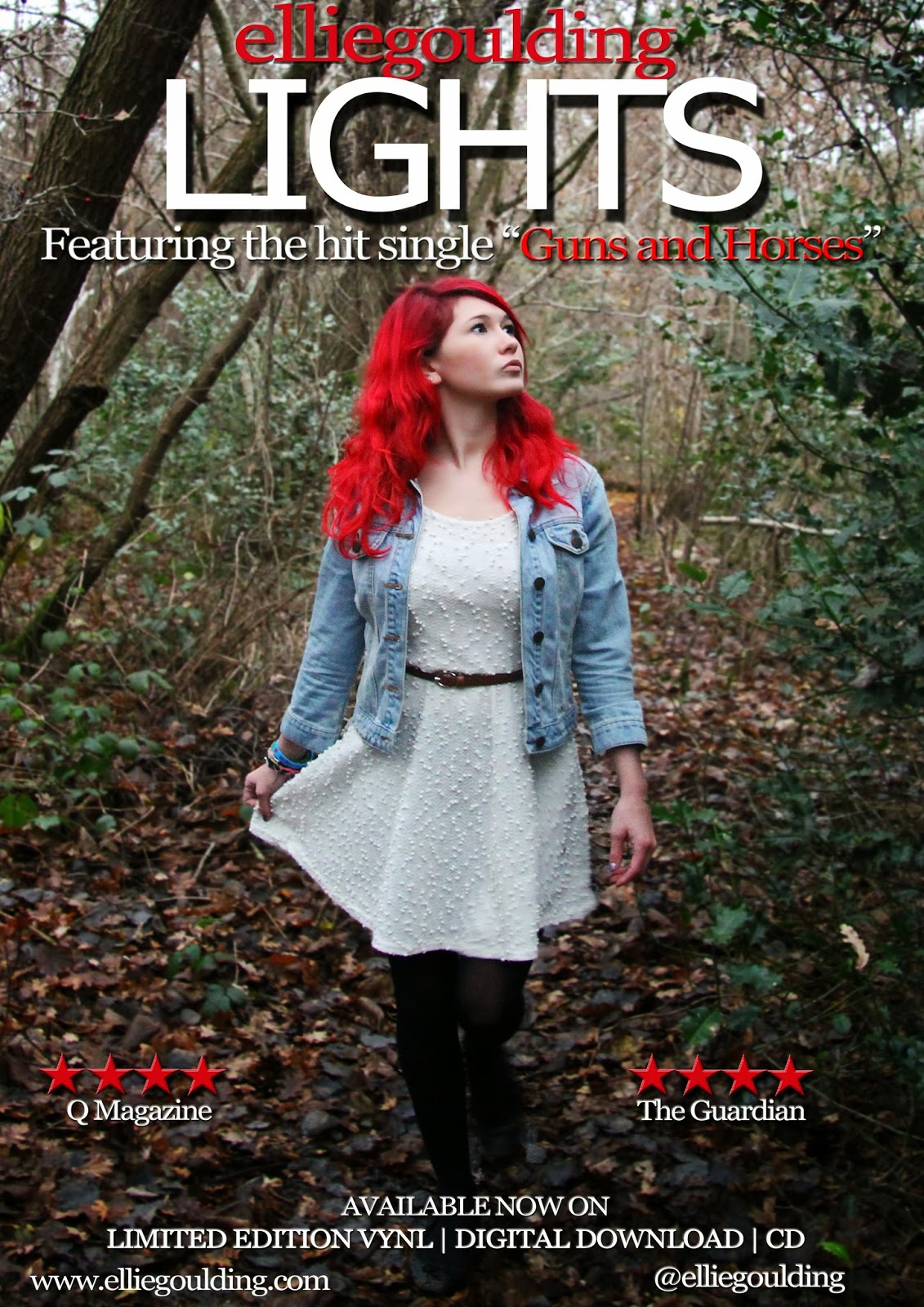
This is the final product of
my album advert. As you can see, I have made many changes in comparison
to my last draft. I showed my teacher and she told
me that my second draft may have looked too much like a film poster, which
I agreed with. So, I made many changes such as moving the album ratings
down to the bottom of the page near the website mentionings etc.. I
also changed the colour of the writing underneath the stars such as 'The
Guardian' from red to white so that it would stand out more. This is
because I figured that the red faded too much into the background which
is the opposite effect from what I wanted. Furthermore, I moved the
'featuring hit single Guns and Horses' to the top of the page, above
'Lights', then I moved 'Ellie' and 'Goulding' down to the centre of the
main image so that there was a gap between the writing to leave space
for Ellie, and so that the font was small enough to fit in. However, I
am not quite sure yet on whether I like this yet or not because I feel
like it fades into the background too much and looks too 'random', but I
am planning on receiving feedback from my target audience in order to
fix this. However, my teacher thinks that it looks better like this so I
will take that into account. Lastly, my teacher told me that my main
image was too 'zoomed out' and even though I really liked the arch of
the trees in the image, this needed to be cut out and the image needed
to me zoomed in on because Georgina looked too small and far away,
making it look like a film poster. I then realised that she wasn't the
centre of attention on my album advert and that I definitely needed to
fix this, so I cropped the image to make Georgina larger. I do think
that this looks a lot better. However, in preparation for my final draft
I will be changing many things, such as font size and type, the colours
to make them stand out, amongst many other features.
However, after creating the third draft of my album advert, I made a few more changes. I changed the 'Lights' font to Tahomi instead, as I realised that using a Sherrif font previously was too old-fashioned and traditional, which I felt wasn't the look I was going for and the audience would appreciate a more modern, 'curvy' font. Furthermore, I felt the 'Ellie Goulding' text was too random right in the middle of the page, so I changed this font to Sylfaaen and made all of the words lower case, with no spaces in the middle. I then moved this to the top of the page, above 'Lights'. I also made this font red. I felt that the red and lower case text really contrasted with the white capitals with 'Lights'. As well as this, I moved the 'featuring hit single Guns and Horses' headline underneath 'Lights', and made 'Guns and Horses' red as it contrasted with the rest of the white text and I wanted it to stand out, as it's the title of the song. I didn't make any more changes than that, because I felt that I had received such positive feedback on my album advert previously and this was from my target audience, so I knew that I shouldn't alter what my audience like.

This is a landscape version of my album advert, in which I decided to create when I had completely finished my portrait album advert and felt that I wanted to go just that bit further to perfect my coursework and get it to the best grade possible. I also created this so that I could place it into some advertisement/promotion technique images, showing the ways in which I could advertise my advert, and one of these was a billboard, which of course I needed a landscape version of my album advert for.
For this landscape version, I simply opened my portrait version and thought of ways in which I could adapt it to ensure that they are both similar, yet differ in various ways. Firstly, I dragged the same image I used in my portrait album advert onto my blank landscape document, resized it to half of the page, and dragged another one over, rotated it and resized this too. This is how I got the symmetrical, 'mirror' effect as you can see with the two images shown. I felt like I wanted consistency and fluency with my album adverts so that my audience could familiarise with them both and not feel that they are too 'different'. So, I simply dragged all of the text/features over from my portrait version, onto my landscape version, and resized them so that they were bigger and everything was symmetrical. This included putting the 'LIGHTS' in the middle, then putting 'elliegoulding' above it, and the headline underneath it. I did adjust some things however, so that the two posters were not too similar and almost 'boring', for example I used a different font for the title and headline. I also did not use a drop shadow on 'elliegoulding' or the main title, 'Lights'. I actually prefer this landscape version of my album advert as I feel it flows a bit more and overall, looks a lot more modern and pleasing to the eye. However, I am very pleased with the ending products of both of my album adverts.


